
 Often in trading we become totally engrossed in searching for short-term opportunities with a hyper-focus on news flow and daily price movements. Occasionally it’s good to drastically alter time frames, especially if your creativity has dried up on short-term ideas. One way to search for new trades is to scan asset classes that have performed the worst over the previous decade. This is especially interesting when there’s been a large divergence of performance in asset class returns over the previous 5 to 10 years.
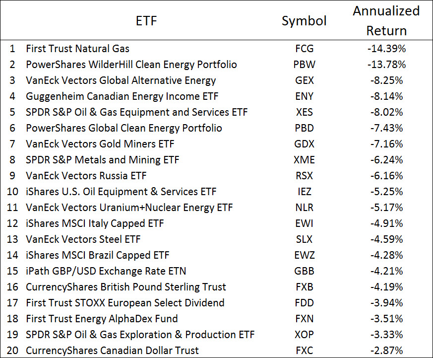
Table 1 shows a ranking of the worst-performing ETFs by 10-year annualized returns as of October 31, 2017. When tabulating this ranking, I excluded the ProShares daily leveraging funds and commodity exchange traded notes. For comparison, the S&P 500 returned 7.51% per year during this time frame. This list contains many ETFs in the energy space, with a few niche asset classes (clean energy, gold miners, steel and nuclear), country funds (Russia, Italy and Brazil) and two currencies (British pound and Canadian dollar).
Table 1: Worst-performing U.S. ETFs based on 10-year annualized returns, as of October 31, 2017. (Note: S&P 500 return over same period was 7.51%/year). Source is Morningstar.
Often these asset classes were popular many years ago, but as the terrible performance persisted over a decade’s time, more and more traders and portfolio managers shifted their focus to better-performing asset classes. With a niche asset class, such as gold mining or solar energy stocks, the last remaining holders are the enthusiasts (gold bugs), index funds and retail investors owning such a small position that to them it’s easier to ignore rather than take a loss on a sale.
Figure 1 shows an example of such a downturn. The PowerShares WilderHill Clean Energy ETF (Symbol: PBW) once held over $2 billion in assets back in 2008 when the clean energy theme was hot. After a decade of poor performance, losing 13.8% per year over the past 10 years, the ETF’s assets now stand at $110 million, and according to Morningstar, the fund has almost $1.2 billion in tax-loss carry forwards. The bottom chart shows the relative strength line (RS line) of PBW versus the S&P 500 ETF (Symbol: SPY). Remember, the RS line shows the relative performance of one asset class (PBW in this case) versus another (SPY) excluding the effect of dividends. When the blue RS line is falling, PBW is underperforming SPY, when the RS line is rising, PBW is outperforming SPY. Notice the long downtrend in the blue line as PBW seriously lagged the performance of the S&P 500 for a long time.
Figure 1: PowerShares WilderHill Clean Energy ETF long-term performance versus the S&P 500 from 2007 to 2016.

We want to examine asset classes that performed poorly over a decade’s time frame and search for signs the long-term downtrend is ending. That’s what this trading edge is all about. Ideally, after years of underperformance, the asset class is an excellent value, is underowned and the trend change happens without capturing the attention of most investors and the media. The bet is that when the trend eventually reverses to the upside, a multiyear period of outperformance will ensue.
The first step is to look at tables of asset class returns over long time periods, such as 5, 10 and 15 years. Morningstar and Lipper track ETF and mutual fund performance over these time periods. The Wall Street Journal and Barron’s often publish their tables quarterly. With Morningstar Advisor Workstation, I tend to sort Morningstar fund category returns and/or ETF returns over the previous 10 years.
Table 1 contains potential asset classes to examine and buy depending on the state of the RS line long-term trend. I’ll call these asset classes negative performance outliers. When none of the outliers show signs of RS line bottoming, then there are no opportunities associated with this trade. When an outlier’s RS line turned three years ago, then the purchase window associated with this trading edge was probably missed.
You need to scan for this trade opportunity at least quarterly to allow sufficient preparation to investigate an asset class when signs that a long-term RS line trend is about to change.
Long-Term Relative Strength Trend Change
Once the RS line shifts from downtrend to uptrend, the expectation is the asset class will continue to outperform over a period of approximately one to two years. That’s it. Beyond that time period, you need to find other tail winds associated with the asset class to justify why the trend will continue higher for longer.
You want to watch for a long-term trend change in the RS line with respect to an appropriate benchmark, such as the S&P 500, Barclays Aggregate Bond Index, the MSCI All Country World Index (ACWI) or whatever asset class has been the star performer over the same time frame. Simply use peak-and-valley trend analysis to identify the change in trend or a mechanical approach using simple trend-following formulas with a very long look-back period (such as 250 to 400 trading days or 12 to 18 months).
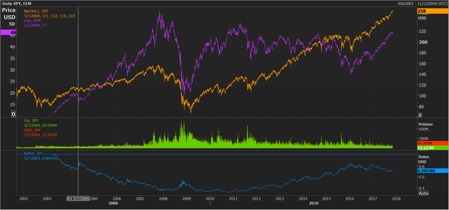
A recent example of such a trade is the relative performance of emerging market equities (Symbol: EEM) versus the S&P 500 (Symbol: SPY), as shown in Figure 2.
Figure 2: Emerging market stocks versus the S&P 500 over the past 10 years, as of September 2017.
The EEM RS line peaked in 2010 and then fell dramatically as emerging market equities underperformed the S&P 500 over the next six years. During that time, EEM’s price basically oscillated in a volatile trading range as U.S. stocks doubled in value. A plot of EEM versus the ACWI may be more appropriate (it has a similar look), but I chose the S&P 500 because U.S. stocks were the best-performing asset class over the 2010 to 2016 period.
Figure 3 shows the same plot over the most recent 10 quarters. The RS line trend of EEM versus SPY established a double bottom, with lows in January 2016 and December 2016, and the November 2016 local high recently surpassed in August 2017. Upon confirmation of the uptrend, this trading edge suggests emerging market equities will outperform the S&P 500 (and ACWI) over the next couple of years. If the RS line rolls over and breaks through the January and December 2016 lows, then we’d sell EEM versus SPY for a loss. If this happens, we were too early in betting on the reversal.
Figure 3: Emerging market stocks versus the S&P 500 over the past 10 quarters, as of September 2017.

There are a number of implementation questions about this approach. First, why is this a trading edge? Is this approach a trading edge or simply a good screen to search for new trading ideas? We’ll examine that question next. There’s also ambiguity in how we confirm an uptrend and determine the time frame of future outperformance. Do we expect one to two years of outperformance after the first or second bottom? How did I come up with one to two years? What’s the best way to confirm the long-term trend change? We’ll tackle those questions later in this blog post.
Is This Technical Screen a Trading Edge?
In past blog posts, I’ve made the case that there’s no trading edge associated with either mechanical trend following or using technical analysis. But what I’m proposing now seems to contradict that view. Why am I willing to bet on trend analysis this time? There are three reasons this particular setup could turn this trend change signal into an asset class trading edge.
First, economic forces have a way of developing to counter long trends. When the economics of an asset class are particularly poor for an extended time period, profits become losses, companies go bankrupt or consolidate, supply is reduced, CEOs tighten budgets and no one considers entering the industry. As they say in the commodities space, nothing cures the problem of low prices like low prices. The collective activities of all those involved in surviving a difficult environment sow the seeds of an eventual recovery.
Prices move before news. Most often, stock prices begin to reverse course well before improving fundamentals becomes obvious to anyone. With sentiment so poor, any positive development leads to improved stock performance. Once the RS line reverses its downtrend, stock prices, fundamentals and confidence in the asset class can feed on each other in a positive way. Sometimes, all that’s needed is a sea change in investor attitudes towards an asset class. To summarize this first reason, there’s a higher likelihood of unexpected improving fundamentals at this point in the chart.
The second reason is that technical analysis and trend-following is more likely to work with this setup. Why? Due to the long downtrend, the asset class will be off the radar of most traders and any long position is likely uncrowded. Trend following always works better with fewer trend followers and traders active in the markets. Having fewer traders corresponds to better trends and less whipsaws.
Also, the time frame associated with this trend change is on the order of a year or more. This is extremely long, and has much more capacity to withstand trader activity. Most trend-following managed futures funds work on a shorter intermediate time scale. Even if these funds start to buy, few will look to allocate heavily to an asset class that’s underperformed for a decade. The bottom line is that the long time scale associated with this RS line trend change will be much more difficult to arbitrage away compared to a run-of-the-mill, intermediate-term trend change.
The third reason is that there can be other compelling trading edges aligned with this setup. Often the asset class is cheap with lots of potential buyers among investors and fund managers.
Additional Edges and Catalysts
I’m viewing a long-term RS line trend change after an extended decline as a trading edge on its own. However, I’m much more interested when other trading edges confirm the setup, which can greatly enhance our confidence to allow for a large portfolio allocation and/or allow us to bet on the trend change before it’s confirmed. Here are a number of asset class trading edges that can enhance conviction levels:
- Market tells – At major turning points, the price action can provide clues that an asset class is acting stronger than it should be on an intermediate-term time scale. This is a strong timing edge for future outperformance and can be used to jump on the long-term RS line trend change much sooner than a signal provided by trend analysis alone.
- Compelling value – If an asset class is an excellent value with high return potential, it attracts investors and reduces the possibility that the RS line will eventually roll over. Even if the RS line rolls over, the “valuation spring” will become further compressed as prices fall, so when the RS line starts to turn back up later, we can perhaps bet even more on the asset class because it’s even cheaper. Valuation is a horrendously bad timing tool, yet that is how the large value managers invest – they tend to average into asset classes as prices fall, often buying years before the RS line bottoms. As an asset class trader, we have a great advantage over these managers to start buying only when the RS line trend is bottoming.
- Underownership – This trading edge will be the subject of a future blog post. Professional money managers, pension funds and retail investors often ignore an asset class that performs poorly for many years. All these investors represent a large pool of potential buyers when the long-term downtrend reverses.
- Compelling positive catalyst – Sometimes the timing of an RS line trend change is related to a compelling catalyst that occurred in the markets. A bubble bursting elsewhere can cause investors to shift focus to an underperforming asset class that’s been ignored for years. A sudden investor mentality change towards the underperforming asset class or a cyclical bear market can also cause long-term RS trends to change.
- Flows – Inflows into the asset class from investors as the RS Line is bottoming is also a positive trading edge.
- Compelling negative catalyst – A negative catalyst or crisis causing a major parabolic sell-off could mark the bottom of the RS line downtrend. An example is a political crisis causing a stock market sell-off in a single country. If the RS line is showing signs of a long-term bottom, we may be willing to buy into the panic sell-off with the combined bet that the sell-off is putting in a long-term bottom in the asset class and prices are too low over the short-term due to indiscriminate selling. More conservatively, we can watch how the asset class reacts to the crisis for signs of underlying strength. A sinking RS line due to tax-loss selling at the end of the year is another example of such a negative catalyst.
- Seasonality – We may want to bet on an emerging RS line uptrend if an upcoming seasonally strong period is imminent.
- Historical cyclicality – Is there a tendency of an asset class pairing to cycle over 5 to 10 year periods? Small cap versus large cap, growth versus value, international versus U.S. stocks. These cycles seem to ebb and flow over these long-time periods. When we see an emerging RS line trend change after a long period of underperformance, we may have more conviction associated with the trade due to this historical cyclicality.
- Long-term fundamentals – Strong belief in the long-term fundamentals of an asset class, industry, country or investment story may provide addition conviction to jump on this setup before confirmation. While not necessarily a trading edge, a strong belief in an asset class can help provide the conviction to stick with the trade through inevitable pullbacks and volatility.
- Insider buying – Strong insider buying can also provide an additional edge with U.S. sub-sector and group-level trades when this occurs while the RS line is showing signs of a bottom.
Here’s an example of a trade I missed back in 2011/2012 – emerging U.S. stock market outperformance. The markets seem to cycle between U.S. and international stock market performance over 5 to 10 year time frames. U.S. stocks dominated in the late 1990s, peaking with the technology/internet bubble in 2000. Then international stocks took the lead up to the start of the great recession and 2008/2009 bear market.
Figure 4 shows a long-term chart of the S&P 500 ETF (Symbol: SPY) versus the EAFE ETF (Symbol: EFA). The falling blue line at the bottom clip shows the relative underperformance of U.S. stocks from 2002 to 2008, and then the rising line from 2008 to the end of 2016 representing U.S. stock market outperformance. Figure 5 shows the same plot of SPY versus the emerging market ETF (Symbol: EEM).
Figure 4: U.S. stocks (S&P 500) versus international stocks (EAFE) from 2002 to 2017.

Figure 5: U.S. stocks (S&P 500) versus emerging market stocks from 2002 to 2017.
I was greatly overweight international and emerging market stocks throughout the 2003 to 2011 period, and was unimpressed by the potential for U.S. stocks becoming the leader again. Even as U.S. stocks began to outperform in 2011 and 2012, I couldn’t figure out why they should outperform. There were no strong flows, and U.S. stocks were not underowned among investors. In fact, at the time, institutional investors were selling U.S. stocks to diversify into private equity, hedge funds and real estate. U.S. stocks were not greatly undervalued versus international stocks, either.
However, after such a long period of underperformance from 2002 to 2008, I should have been open-minded that economic forces were sowing the seeds of a reversal. The reversal of the long-term RS trend in 2010 to 2011 should have signaled to me that U.S. stocks would continue to outperform, even though the economic reasons for such a switch had yet to emerge. Awareness of this trading edge would have saved me a lot of pain associated with eventually capitulating on our emerging markets overweight.
As U.S. stocks outperformed, the fundamental story began to develop around an aggressive U.S. central bank that was far ahead of foreign central banks in implementing a zero-interest rate policy and quantitative easing in response to the great financial crisis of 2008/2009. Better growth in the U.S., massive buybacks among U.S. corporations and a realization that rates would stay low for a long time also propelled U.S. stocks higher versus international stocks. In the meantime, economic excesses associated with the 2003 to 2007 economic boom among emerging countries, along with falling commodity prices, weighed on their fundamentals.
The long-term RS trend change should have signaled to asset class traders that U.S. stocks were on the verge of outperforming for a couple years beyond 2011.
Implementation Questions
When is a long-term RS trend change confirmed? At what point during the year-long bottoming pattern do we buy? There’s no one answer to this question. Be open-minded about the implementation – you can miss considerable upside by waiting for confirmation. Certainly when a second bottom is in place that’s above the previous bottom, then it’s time to get serious about figuring out position size and when to buy. The more trading edges (discussed above) that are aligned with the long-term RS trend change, the faster you should implement it and the bigger the bet.
Once the long-term RS trend change is confirmed, how much longer is this trading edge in effect? I can only guess at an answer. The time scale of the trading edge is probably on the order of the time scale of the trend reversal – perhaps two to three years after the first bottom or one to two years after confirmation. This provides time for the positive fundamentals to develop and investors to become aware of them and rediscover the asset class. Expecting a future of 5 to 10 years of outperformance after the bottom is asking for too much. As stated above, you need to find other tail winds associated with the asset class to justify why the trend will continue higher for longer time periods.
What Can Go Wrong?
As with any trading edge, there are a number of ways a trade may not work. Number one on the list is that the RS line eventually rolls over making a new low, and it turns out we were just too early. This is sort of a “value trap” type failure. Due to the long-term nature of the price pattern, a rollover of the RS line to new lows can take a half a year or more – that’s a lot of time wasted in a trade that didn’t work.
If an asset class dramatically underperforms for a long time, it doesn’t mean it’s about to outperform. Since the 1990 stock market bubble peak, Japanese stocks have suffered a 25+ year old decline in value versus the ACWI. There have been a few long-term RS line reversals to the upside during this period, but none led to a secular period of outperformance.
Another possible failure associated with this pattern is that the asset class is basically a market performer for the next couple of years, which again represents a lot of wasted time in a non-performing asset class. And if traders and hedge funds are attracted to the trade early in the bottoming process, then more volatility and whipsaws in the RS line should be expected.
Lining up additional trading edges (described above) with the long-term RS line trend change should help reduce the risk of these failures. Also, past failures could lead to increased trader reluctance to jump on this trade when it eventually turns for good.
Major Asset Classes versus Niche Asset Classes
For a variety of reasons, I’m generally more comfortable with this trade when the long-term RS trend change is occurring with a major asset class. Before getting to why, here are the major asset classes:
- Major sectors that make up at least 5-10% of the S&P 500 or ACWI, such as technology, health care, financials and energy.
- Major U.S. and international style boxes – small, large, value and growth.
- World regional indices.
- Various major bond indices.
- Major currencies and gold.
The more obscure and niche asset classes include:
- Individual country funds, especially emerging market countries.
- ETFs introduced to exploit niche growth stories, such as robotics, 3-D printing, etc.
- Smaller industries and groups.
One advantage of the major asset classes is that the trade will never suffer from a dramatic value trap, with a value going to 0. Typically, when a major asset class falls in price, it becomes a better value, with higher future expected returns. The major assets classes tend to move in cycles, which can provide another reason to bet on an RS line reversal after a long decline.
Niche asset classes are typically much more volatile and loaded with idiosyncratic risk. You’ll lose more if the trade doesn’t work. Some niche sectors may fall 90% in value and never recover. With emerging country indices, we must worry about political risk, coups, corruption, property rights, nationalization of assets, state-owned enterprises, defaults and revolutions that may limit any sort of recovery from a deep long-term decline. Valuation measures can be very stale, and the economic pendulum can take much longer to reverse course as those in power have a vested interest in the status quo.
Major asset classes also tend to be a much larger portion of benchmarks, so they deserve larger allocations just to implement an overweight. A possible trade with a niche asset class can be completely ignored à la Warren Buffett’s “unlimited pitches” view of investing.
Large pensions funds, advisors and retail investors often allocate among major asset classes. We like competing against these investors when trading asset classes because their allocation moves are very gameable. These investor groups are not typically involved in the niche asset classes, so we are usually competing with professional mutual fund and hedge fund managers in the niche markets. We generally don’t want to compete with these experts.
Finally, it’s difficult to find other ways to add value with the niche asset classes. We are not experts in the nuances associated with the industry dynamics or politics of an individual country. Market tells are more difficult to interpret. Often, the only trading vehicle that can be used in the trade is a single market-cap weighted ETF.
Conclusions
Searching for long-term relative strength trend changes among asset classes that suffered a decade of poor performance is an approach that should be in every asset class trader’s toolbox. These opportunities occur infrequently, but when they do, you should at least investigate and evaluate them versus other investment ideas.
Is this an actual trading edge or just a nice screen to search for opportunities? At this point, I don’t think it matters. I will continue to use this screen to search for future ideas to outperform the market and be open-minded that an emerging long-term RS trend change is worth investigating even when there is no news or explanation for why the trend seems to be changing.
Disclosure
The content contained within this blog reflects the personal views and opinions of Dennis Tilley, and not necessarily those of Merriman Wealth Management, LLC. This website is for educational and/or entertainment purposes only. Use this information at your own risk, and the content should not be considered legal, tax or investment advice. The views contained in this blog may change at any time without notice, and may be inappropriate for an individual’s investment portfolio. There is no guarantee that securities and/or the techniques mentioned in this blog will make money or enhance risk-adjusted returns. The information contained in this blog may use views, estimates, assumptions, facts and information from other sources that are believed to be accurate and reliable as of the date of each blog entry. The content provided within this blog is the property of Dennis Tilley & Merriman Wealth Management, LLC (“Merriman”). For more details, see the Important Disclosure.