
Executive Summary
In this post, I examine the popular stock market valuation tool, the Shiller CAPE. The Shiller CAPE valuation approach, based on 150 years of data, appears to have an uncanny ability to predict future S&P 500 returns.
Unfortunately, the benefits of using this tool for actual investment decisions appear to be limited. The Shiller CAPE, along with all asset class valuation measures, has the following significant weaknesses and issues.
- Selection bias has likely overstated the reliability of predicting future expected returns.
- Using CAPE to shift between equities and T-bills doesn’t enhance risk-adjusted returns.
- Using historical valuation data is susceptible to unpredictable long-term regime shifts that can devastate the effectiveness of such a tool.
When the Shiller CAPE is low, risks are high, and many competing asset classes are also priced cheaply. When the CAPE is high, competing assets also have low expected returns. It appears the S&P 500 is efficiently priced on the time scale used for value investing.
The best use of the Shiller CAPE is simply to set return expectations, specifically if valuation multiples revert to a long-term mean. Such expectations should also be contrasted with no-mean reversion return estimates, such as assuming the S&P 500 is simply priced to deliver a 3-5% premium over the current values of any of the following: T-bill yield, S&P 500 yield, 10-year treasury yield or inflation rate.
 Introduction
The primary reason I write this blog is to reexamine the variety of asset class trading approaches I’ve used for years. I don’t want to waste time implementing tools that appear useful, but ultimately fail to enhance risk-adjusted performance. In this post, I examine Shiller CAPE, which should have implications for using historical valuation charts in general and asset class valuation tools produced by firms such as GMO, Research Affiliates and many others.
The most popular stock market valuation tool right now is the Shiller CAPE ratio. The Shiller cyclically adjusted price-to-earnings (CAPE) ratio divides the S&P 500 price by the average of the past 10 years of earnings.1-3 The averaging helps smooth out earnings volatility associated with recessions. Investors love this model because it’s very intuitive and appears to be quite good at predicting future equity returns.
Over the past five years or so, I’ve been reluctant to overweight U.S. stocks in my discretionary portfolios due to the belief that U.S. stocks were significantly overvalued based on the Shiller CAPE ratio. Unfortunately, that hasn’t worked as U.S. stocks have been the top performing asset class over that period.
I’ve been thinking a lot about using asset class valuation tools to make investment decisions for a number of reasons. I’ve been working on our firm’s long-term (30-year) asset class return assumptions used in our Monte Carlo retirement simulation tool. I’ve also been toying with a valuation tool for U.S. mid-priced rare coins, which have been in a secular bear market since 1989. Finally, the valuation spread between U.S. and international stocks seems unusually wide, so reexamining the valuation tool now seems appropriate.
The usefulness of the CAPE valuation tool has been debated for many years, with both sides represented by people I highly respect. The pro-CAPE champions are highly intellectual and thoughtful practitioners represented by Jeremy Grantham of GMO, Rob Arnott of Research Affiliates and Dr. John Hussman of Hussman Funds. Their firms manage tens of billions of dollars using asset class valuation models as the basis of their investment philosophy. Without question, their charts and tables are visually compelling, and they’ve influenced the decision-making of an immense number of professional investors, including myself.
The antagonists are mostly academics and a few practitioners (in particular, AQR Capital Management led by Cliff Asness).4-8 They argue the Shiller CAPE is of limited value – it’s only useful in managing future return expectations. At this point in time, the CAPE is very high compared to history. The antagonists contend that all you can do with this information is expect lower than normal returns in the future.
I’ll admit I came into this investigation with a bias that the CAPE ratio was quite useful. This has been a very contemplative exercise for me. I read lots of literature, I analyzed historical data, and I wrote drafts of this article and then threw them away to start over again. Assessing the usefulness of historical valuation charts is a tough and subtle problem.
I’ll also say I have no horse in this race, so I’m open minded about the conclusions. Our core investment portfolios are designed with a 30-year efficient market/risk premium view. Valuation and mean reversion don’t factor into our decisions. For our tactical portfolios, we definitely consider asset class valuations, which is why I’m taking a critical look at this approach.
Asset Class Expected Returns 101
Below is one formula for calculating expected annualized returns.
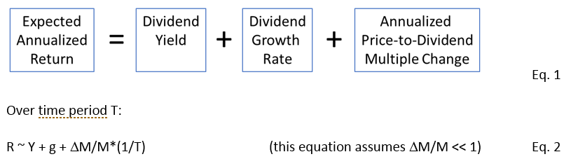
For example, if the dividend yield is 8%, and we assume a growth rate of 2%, and we assume the multiple remains unchanged, then we’re predicting a return of 10% per year. If the yield is 2% and we assume a growth rate of 6% per year, but also expect a multiple contraction from 50 to 40 over 10 years, the expected return is approximately 6% per year.
Over decades and centuries, the price-to-dividend ratio is expected to vary within a reasonable range over time, while also having the occasional extreme outlier moments to the upside (bubbles) and downside (depressions or inflationary spikes).
All of the above terms in Equation 1 can contribute to returns behaving in a mean reverting way over long time periods. As prices rise and fall, dividend yields go down and up. Over longer time periods, high growth is often followed by extended periods of low growth. High rates of returns can force the valuation multiple higher, perhaps due to excessive optimism and investor performance chasing. If the multiple is driven to the high end of the historical range, we can expect lower than normal returns as the multiple drifts back to the mean, and the last term of Equation1 is negative.
More broadly, the above equation works for any asset class including non-income producing assets such as growth stocks, waterfront property and gold. The last term of Equation 1 can be generalized to any multiple based on any valuation anchor that suits the asset class and generally goes up in value at a similar rate. Examples of valuation anchors include smoothed earnings, book value, GDP, replacement value, sales, median home price, median discretionary income, inflation indexes, population, etc. Ideally the valuation anchor is smoothly varying.
Thus Equation 1 can be generalized:
The last term in Equation 3 often garners the most interest by portfolio managers and market strategists because it’s often large and volatile compared to the first two terms. Although an alternative and often prudent course for assessing future expected returns is to assume the multiple doesn’t change at all. Then a rough guess of growth rate and the current yield can lead to a reasonable estimate of future expected returns.
Expected Returns for T-bills, Treasuries and Inflation
When assessing the relative value of asset classes versus each other, we should have a handle on the expected returns for bonds and inflation. Developing long-term return estimates for T-bills, treasuries and inflation is relatively simple compared to equities.
The growth and mean reversion terms in Equation 3 are small compared to the yield for bonds. The 10-year expected return of a portfolio of 10-year bonds is simply the 10-year yield, which currently stands at about 3%. While you may feel that treasuries are over or undervalued, the current yield provides an excellent estimate of future expected 10-year returns because bond math also supports this estimate. If rates go up, the value of these bonds fall, but income is reinvested at higher yields to make up for those losses. If rates go down, bonds become more valuable, but income is reinvested at lower rates.
There are a variety of valid ways to estimate inflation over the next 10 years. We can infer the consensus inflation rate over any time period by comparing nominal treasury and TIPS yields. For durations ranging from 1 to 30 years, this rate is currently close to 2%. We can also use the Federal Reserve’s target rate of 2%. Assuming a future inflation rate well above or below 2% would constitute a surprise to market participants and cause a repricing of all asset classes.
Since there’s little volatility in T-bill returns, we can estimate expected returns a few ways. Historically, over the last 100 years, real T-bill returns have been close to zero9 among many countries. We can also use the Federal Reserve’s estimated neutral policy rate or assume a rate that is slightly above or below the inflation rate depending on central bank policy. Currently, the European and Japanese central banks are holding cash rates well below inflation to support their debt-laden, low-growth economies. I’d expect this policy to continue for the next decade.
Using the Shiller CAPE to Predict Future S&P 500 Returns
Compared to bonds, T-bills and inflation, predicting equity returns is an order of magnitude more difficult on all time scales. Professional investors have long used valuation versus time data to assess asset class valuations and future expected returns. We’ll study the Shiller data and focus on U.S. market cap weighted returns for a few reasons. First, the Shiller CAPE is currently the most popular equity valuation tool. Second, there’s a long history of valuation data for U.S. stocks compared to international stocks. Data for the Shiller CAPE can be found conveniently at Robert Shiller’s data site.
I’m also a U.S.-based investor, so the S&P 500 plays a large role in my benchmarks. Finally, the U.S. economy and the U.S. stock market remains dominant in the world today, with the S&P 500 by far the most liquid actively traded stock market index in the world. This market rapidly incorporates new information, so we’d expect it to be efficiently priced on most time scales. Lessons from this analysis should help us understand the usefulness of valuation tools in trading any asset class.
Figure 1 shows the historical variation of the CAPE ratio going back to 1871. As the chart shows, the multiple on earnings has varied from as low of 4.78 in 1920 to as high as 44.2 at the bubble peak in 1999.

Figure 1: S&P 500 Shiller Cyclically Adjusted Price-to-Earnings (CAPE) Ratio (from this website). The latest number is as of December 6, 2018. Data previous to 1881 uses smoothed earnings from 1871 up to that date.
Figure 1 is usually interpreted as evidence that valuation multiples are mean reverting around the horizontal midline of the chart (the average CAPE ratio is 17). We assess that stocks are expensive when the CAPE ratio is well above average and cheap when well below average. The price associated with a CAPE ratio of 17 can be thought of as the long-term (100-year time frame) intrinsic value of the S&P 500 discussed in the previous blog post.
Figure 2 shows a scatter plot of nominal S&P 500 10-year returns versus starting CAPE since 1926. Note that in the following analysis, I use total return data from 1926 and beyond. While there’s a lot of scatter, the R-squared of a linear regression is a respectable 0.54. This is a powerful visual chart that fits nicely with the intuition that the market is strongly reverting. 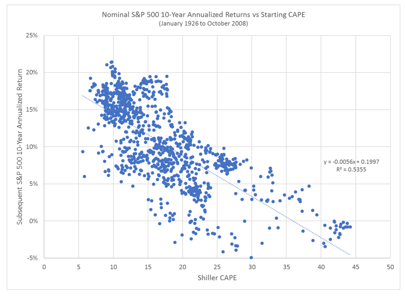
Figure 2: Nominal S&P 500 10-year annualized returns versus starting CAPE (January 1926 to October 2008).
Figure 3 shows another compelling chart, this time splitting subsequent 10-year nominal and real annualized returns into quintiles of starting CAPE. There’s a huge spread between returns associated with the cheapest 20% of CAPE multiples and the most expensive 20%. Figure 3: Quintile ranking of subsequent 10-year nominal and real S&P 500 annualized returns based on starting Shiller CAPE.
Figure 4 shows the same quintile ranking, but this time showing the subsequent return over the next 12 months. Table 1 below shows how the regression R-squared and first/fifth quintile spreads vary with holding period. The results are robust for holding periods beyond five years. While not shown here, the results are also insensitive to the CAPE earnings smoothing look back period when varied around the 10-years used by Shiller.
Without scrutiny, these charts are visually compelling and seem very useful for asset class trading and investing. Figure 4: Quintile ranking of subsequent 12-month nominal and real S&P 500 returns based on starting Shiller CAPE.
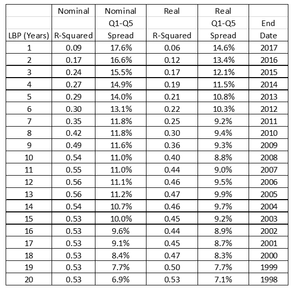
Table 1: Effect of hold period on regression R-squared and first/fifth quintile spread.
A few, well-respected money management firms have based their flagship fund’s investment philosophy on this sort of asset class valuation approach. These firms include GMO, Research Affiliates and Hussman Funds, although I’ll note that all three firms offer many other investment portfolios that add value with other approaches such as individual security selection. They’ve all made their improvements to the above CAPE model to suit their own preferences regarding operating margins, the earnings measure and accounting inconsistencies.
These firms strongly believe asset class value investing provides enough of an edge to achieve superior net-of-fee performance for their clients. Overvalued asset classes are to be avoided and even shorted. Undervalued asset classes are to be bought and held. Asset valuation multiples are expected to revert to the mean over 7-12 year time frames.
This approach has had some spectacular anecdotal successes, which has led to strong inflows into the above firms. Such calls include selling out of U.S. stocks leading up to the 1999 bubble, overweighting emerging market stocks in the early 2000s, and again underweighting risky asset classes in 2007 before the Great Financial Crisis (GFC) of 2008-2009.
Despite the very recent drop in prices, as of November 30, 2018, the Shiller CAPE is still at a level (>30) suggesting a substandard nominal annualized return of 2-3% per year over the next 10 years. Compared to cash and bond yields, also at 2-3% per year, it appears the S&P 500 is irrationally priced for perfection. This seems like a compelling reason to underweight U.S. stocks.
Of course, U.S. stocks have been highly overvalued based on CAPE since 2011, and the multiple has continued to expand as the S&P 500 has significantly outpaced practically all foreign stock markets over the last five years. Since that time, especially over the past five years, performance (as Table 2 below shows) associated with this asset class valuation approach has suffered, and clients have yanked money from these funds.10
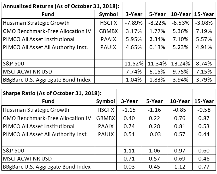
Table 2: Performance of flagship funds associated with asset class value investors as of October 31, 2018. Research Affiliates is the subadvisor for the PIMCO funds. Data from Morningstar.
It’s been a tough 10 years for practically all active portfolio management strategies, so the point is not to pick on these guys. Now may indeed be a great time to finally heed the warning signal that the CAPE has been flashing for years. Value managers who’ve used tools like CAPE to underweight or short U.S. stocks have no choice but to stand their ground and point to charts like Figures 1-4.
GMO was early in reducing S&P 500 exposure in the late 1990s, but were ultimately vindicated with accolades and fund flows after the bubble burst. Value managers are also the first to admit that the timing of a downturn is unknown, but then argue that prudence demands avoiding expensive U.S. stocks. The success of this stance hinges on the mean reversion time scale being 10 years or less.
With the benefit of hindsight, powerful narratives can be built around value-based market timing success stories. There’s an unquestioned ethos in the investment business that value investing is prudent, intellectual, scientific – i.e., this is how the smart money is managed. Much of this view is justified, but it’s based on the strong logic and success of value investing among individual securities within the same asset class. Extending this logic to using value assessments to switch between stocks and cash is a much more questionable practice.
While the charts shown above are visually compelling, especially when espoused by a portfolio manager who’s successfully called a previous market top, there are major issues with using the CAPE ratio (and any asset class valuation measure) to make investment decisions.
Issue 1: Selection Bias Overstates Effectiveness
Investors subconsciously favor nice range-bound valuation charts with frequent periods of overvaluation and undervaluation. They are visually compelling, mean reversion appears to be strong, and timing models using such an indicator can show value-added performance. The risk is that because there are so many time frames, valuation anchors and parameter knobs to vary, we are ultimately fooling ourselves with data mining.
When I look at valuation charts, my eyes immediately look to see how the measure did at predicting turning points in history associated with various market tops and bottoms. When attempting to assess an asset class’s valuation, I often end up scanning many different charts and zero in on the chart that’s best looking (i.e., appears to have the most explanatory power). Logic suggests that if I’m scanning a bunch of ugly charts to find the best one, then the best chart probably has about as much explanatory power of all the rejected charts.
Before Shiller CAPE became the de facto stock market valuation tool, other valuation models held favor with investors. Each valuation model was reasonably intuitive, but their primary attraction was a nice history of range-bound valuation multiples.
One popular model used in the 1980s and 1990s was the Dow Jones Industrial Average (DJIA) dividend yield. Figure 5 shows a history of the yield going back to 1915, with the top clip showing the DJIA compared to its dividend stream and the bottom clip showing the dividend yield over time. Two levels were highlighted in the bottom clip of Figure 5 – a “market is expensive level” for dividend yields less than 3.33%, and the “markets are cheap” level of 6.06%. These levels were chosen in 1970s and 1980s due to what seemed to be an exceptional ability to indicate market tops and bottoms. Up to the early 1990s, this was an ideal, well-behaved valuation chart. Many market strategists used this indicator well into the late 1990s.
After that, dividend yield became a relatively useless indicator for value assessment as U.S. companies relied on share buybacks as a more tax-efficient distribution of earnings. This sort of regime shift is common in valuation measures – the range of variation over the last 25 years is drastically different than the previous 100 years. However, we can’t rule out an equally likely reason for the failure –the cherry picking of a well-behaved valuation chart many years earlier. Further hindsight bias allowed the selection of overvalued and undervalued levels that worked great in the past, but largely overstated the effectiveness of this indicator.
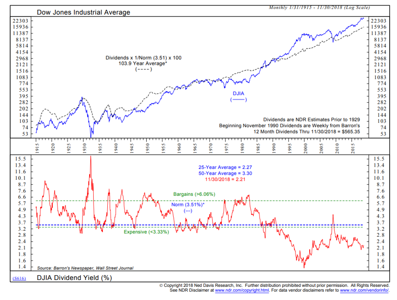 Figure 5: Historical variation of the Dow Jones Industrial Average dividend yield. From Ned Davis Research.
Compare Figure 5 with Figure 6, which shows the DJIA with price to book. Price to book is another very reasonable valuation anchor, but it had a much longer cycle between expensive and cheap compared to dividend yield, and thus was less favored as a valuation model. Just like with dividend yield, price to book appeared to regime-shift to a new range over the past 25 years.

Figure 6: Historical variation of the Dow Jones Industrial Average price-to-book ratio. From Ned Davis Research.
Figure 7 shows the Fed Model commonly used in the late 1990s and early 2000s to assess the intrinsic value of the S&P 500. Dividend yield had stopped working in the mid-1990s, so investors found another model. This model was attributed to an economic report the Fed issued in 1997. The Fed Model compared the S&P 500 forward earnings yield with the 10-year treasury yield. While it was commonly known that Fed Model logic broke down in early periods of history, the nicely behaved range from the early 1980s to early 2000s was just too enticing for investors to ignore.11

Figure 7: History of the Fed Model. From Ned Davis Research.
Just like the dividend model, the Fed Model eventually “broke” because it suggested the S&P 500 was deeply undervalued in 2003-2007, even though the S&P 500 was the worse-performing equity asset class during this period, and also failed to predict the top associated with the massive 2008-2009 bear market. The post-crisis period of extremely low interest rates has further discredited this model, which isn’t surprising since this model didn’t work in periods before the 1980s. As this Fed Model faded from use, the Shiller CAPE rose to prominence as the current stock market valuation tool.
Interestingly, using other reasonable valuation anchors such as smoothed dividend yield, dividend yield + CPI, book value, market cap to GDP also show charts that look much like Figures 2-4.4,12 Strong regressions and Q1-Q5 spreads are also seen, although not as strong as CAPE. However, since dividend yield and book value have been in the excessive bearish zone since the mid-1990s, no one puts those charts into their presentations anymore.
Out-of-sample studies with international stock markets have also shown value matters in determining future returns.4,12 Studies using CAPE and book value with international markets going back to the 1970s are a good out-of-sample test of this approach, but this date range greatly mirrors the U.S. experience of high inflation in the 1980s and falling bond yields since then.12
Dimson, Marsh and Staunton investigated dividend yield with over 20 developed markets from 1909-2012 using a smoothing methodology similar to CAPE.4 They calculated regressions and return spreads that were also compelling for the U.S., but half as strong in non-U.S. markets, which again suggests the mean reversion effect is likely not as strong as Figures 2-4 indicate.
We can view all the above evidence as out-of-sample verification that valuation matters with future expected returns. However, the strength of the mean reversion effect associated with the U.S. CAPE ratio is probably overstated due to selection bias.
Another critical issue associated with this sort of valuation analysis is knowing the entire range of values with the benefit of hindsight. This can greatly enhance the mean reversion effect that is likely much weaker than it appears.
Here’s an experiment to illustrate this point. Use a Monte Carlo simulation to produce 150 yearly returns assuming a log-normal distribution, a mean of 10% and a standard deviation of 15%. Then draw an exponential trendline from start to end point of the total return chart. Or, calculate a least-squares fit line of that same equity curve. Either of these lines can serve as the fair value line, so when the equity curve is below the line, the market is viewed as undervalued; when it’s above the line, the market is viewed as overvalued. The table of R-squared and Q1-Q5 spread versus look-forward period looks eerily identical to Table 1.
This is the math associated with knowing the range ahead of time. Mathematically, future returns associated with starting points below the “fair value line” must be higher than future returns associated with starting above the line. Any chart showing performance versus deviation from a trendline must be viewed with heavy skepticism if the trendline was formed using the entire data range.
This is not to say the equity returns are not mean reverting. Just that the effect is likely weaker than seen in back testing. We notice, to be shown later, that return volatility rises dramatically when the market is trading at cheap levels. This is consistent with expected returns rising and multiples contracting during highly risky moments in history, and not consistent with a random number generator spitting out returns. Second, we see strong mean reversion of future returns with past returns in the 12-20 year time frame without using any valuation anchor. Again, this would not be seen with a random number generator and is consistent with the idea that expected returns are mean reverting since all terms on the right-hand side of Equation 3 are mean reverting.
Another set of minor criticisms of the CAPE are the various modifications to account for earnings growth, buybacks, margins and various accounting nuances. These are minor tweaks to a valuation measure that has many larger issues. Another minor criticism of the above CAPE analysis is the lack of independent 10-year time periods in the above analysis.13 The use of overlapping performance data seriously reduces the statistical significance associated with the tables above. The bottom line associated with this critique is that 150 years of data is still way too little to scientifically quantify the mean reversion effect.
This latter issue doesn’t bother me as I tend to like trading edges where there’s a lack of data to test them, because it keeps the quants away. I’d much rather exploit a well-thought-out trading edge using a small amount of data than wait years to scientifically verify the effect. By that time, the trading edge will be on its way to be arbitraged away.
To summarize issue 1, it’s likely that selection bias has caused us to gravitate to the Shiller CAPE because of the well-behaved nature of the chart. Second, knowing the entire range of the valuation measure can greatly improve the backtested mean reverting effect. Both these effects likely cause a major overstatement of the usefulness of historical valuation data to make investment decisions. Common sense suggests CAPE ratio R-squared and Q1-Q5 spreads will drift lower over time.
Issue 2: CAPE Is a Useless Market Timing Tool
When you look at Figures 2-4, it seems CAPE could be a handy market timing tool to shift between stocks, bonds and cash. To examine this, I calculate the performance of a market timing model that shifts into cash from U.S. stocks when the CAPE is in the most expensive quintile.
Figure 8 shows the results of such a study from 1926-2017. I used a CAPE of 23.4 as the cutoff, where 80% of CAPE values between 1926 and 2017 were below this value. As the chart in Figure 8 shows, the timing system does not improve risk-adjusted returns. As I reduce the timing system sell level, the return falls along with the standard deviation, but the timing system never significantly outperforms a mixture of stocks and cash on a risk-adjusted basis.

Figure 8: Performance of a CAPE Valuation Market Timing Tool.
Varying the timing system logic rules does not change this result. AQR also studied a variety of timing models showing that risk-adjusted returns were not improved.6-7 This is a really discouraging result considering the hindsight bias built into the CAPE valuation model and considering just how compelling Figures 2-4 are.
Why is this the case? One issue is that when the multiple was cheap and expected returns were high, all other asset classes were also cheap. In July 1982, the S&P 500 CAPE was only 6.6, its dividend yield was 6.2% and its book value was less than 1. That screams of an irrational bargain. However, at that time, 10-year bonds were yielding 14%, and T-bill yields were at similar levels. Foreign equity markets were also priced very cheaply, with low CAPEs and price-to-book ratios less than one.
Table 3 shows six historical trough moments associated with CAPE. Two were associated with massive depressions (1877 and 1932) and one with a post-World War I depression. U.S. government long bonds can be very attractive when consumer prices are falling, and central banks are pushing their currencies back to old pegs versus gold.
Unfortunately for the timing model, stocks were expensive at the same time T-bill returns were low. Figure 3 shows the S&P 500 real return is still 2% per year in its most expensive quintile, which is most often better than T-bill returns. Since it’s likely Figure 3 overstates the future Q1-Q5 spread, the real return of the S&P 500 will likely be larger than 2% when the CAPE roams around in the expensive zone in the future. That’s not good for market timing.
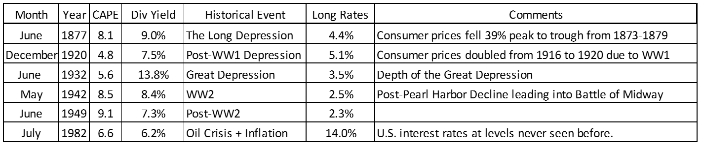
Table 3: Shiller CAPE lows over the past 150 years.
Another reason the timing model doesn’t add value is that when stocks were cheap, the risks were also very high. Extreme cheapness appears to occur only in periods of high uncertainty associated with deflation or inflation. All secular lows (except 1949) in Table 3 were associated with highly risky moments in history, where investing in equities would have been scary.
Figure 9 shows the annualized standard deviation of monthly returns in each CAPE quintile bucket, which reaffirms the view that expected returns go up appropriately because risks are higher.

Figure 9: Volatility of monthly returns associated with the previous month’s CAPE.
All this data suggests the S&P 500 has a time-varying risk premium that depends on a variety of global macro conditions. That’s very intuitive and not surprising. Also, it appears the S&P 500 is efficiently priced on long time scales.14 This is consistent with my own experience on short and intermediate time scales – there are very few moments when we can find an exploitable wrong price with the S&P 500. This is the most liquid equity market in the world. It does a great job reflecting new information about the growth prospects of the U.S. economy. The inability of the valuation timing model to enhance risk-adjusted returns suggests the stock market is doing a great job establishing a fair price considering the risks faced in the future.
Only at extremes can we make an educated guess that perhaps stocks were irrationally priced. Perhaps prices were irrationally too low at the various dates shown in Table 3. Taking an optimistic view of the U.S. economy was ultimately the correct bet at these moments. We also know the two peaks in 1929 and 1999 were associated with stock market bubbles and irrational pricing. I have no explanation as to why the CAPE peaked in the early 1900s and mid-1960s. The current CAPE, valued north of 30, is certainly in an extreme overvalued zone, and I’m open to the idea that it’s time for the S&P 500 to at least underperform the ACWI over the next 10 years.
There are also serious practical issues with using value measures to raise and lower equity exposure without some sort of timing catalyst. Getting out of the market too early can cause significant psychological pain for you and your clients. In the latest run since the stock market bottom in 2009, the Shiller CAPE entered the most expensive quintile in 2011. That’s an enormous amount of upside missed since the signal to lighten up on stocks.
Even if the CAPE analysis accurately captures future return expectations, the uncertainty and high variation of 10-year returns shown in Figure 2 practically guarantees long periods of getting it wrong. It’s likely most human beings will eventually capitulate during one of these difficult periods, like the one we’re in now.
Even if you’re fortunate to be fully in cash at the beginning of a bear market, you’ll need to decide how to phase purchases on the downside. A shallow bear market may trigger no buying, which would be extremely frustrating to be right but fail to make money from the insight. I remember searching the various value measures in the depths of the GFC in March 2009. Was the S&P 500 at a compelling valuation? At that time, it was a mixed bag, depending on the indicator.
The CAPE ratio shown in Figure 1 fell to the mid-level of the chart in March 2009. Nothing special, especially if you think prices should overshoot to the downside before eventually bottoming. GMO ran into this issue during that time, watching the market bottom and head higher with too much dry powder waiting for another shoe to drop. This can also be a problem if you use all your dry powder too early, and then watch as the market continues to fall while you have no more cash to put to work at even cheaper prices. There’s no right way to phase purchases on the downside, but the likelihood of hitting the timing just right is low.
Issue 3: Poor Logic with Respect to Regime Shifts
On a 100-year time scale, fair value may indeed be near the midpoint of the CAPE historical variation shown in Figure 1 (the average CAPE level is about 17). However, on the time scale relevant to value investors – 5, 10, 20 and even 30 years out – the fair value level of the CAPE ratio may be quite different than 17.
Asset classes evolve over time. Investors learn. What matters changes over time. Before the 1920s, stock yields were typically higher than bond yields because investors failed to consider that dividends grew with inflation over time. Tax rates, inflation, interest rates, central bank policy, demographics, accounting standards, profit margins and wage pressures can all cause the fair value mid-point line to change over time. All the evidence above suggests the CAPE ratio is actually near fair value for a 5-10 year hold period.
There’s no fundamental reason why a valuation multiple must mean revert on a time scale that’s useful for us. There’s no fundamental law that forbids the mean reversion time scale to be very long, on the order of 25-50 years. Perhaps that’s the time scale for mean reversion associated with dividend yield in Figure 5.
Historical data suggests equities are priced to deliver a premium above bonds and T-bills of about 4-6% per year. While it would be irrational for stocks to be priced with no premium, there’s no law that says the premium can’t be 2% per year over the next 25 years. There’s no law that says real GDP must grow at 3% per year. In Europe, real GDP growth rates have slowed over the past few decades. Perhaps there’s a 100-year trend towards lower risk premiums as the world has become safer, central bankers have become smarter and information has become cheaper. All these scenarios are perfectly logical and reasonable. Valuation models that use historical data can’t react to these sorts of regime shifts.
One way to guard against regime shifts is to assume the mean reversion term in Equation 3 is zero, and then calculate an expected return using the current yield and a future growth rate estimate. The no-mean-reversion return estimate can be contrasted with a model that assumes the valuation multiple mean reverts over a 5-10 year period. Perhaps the alpha is in the second-order thinking (à la Howard Marks) in deciding which model to follow.
Implications for Other Asset Class Valuation Charts
The lessons learned from analyzing the CAPE valuation model apply directly to all asset class valuation models. For instance, when I look at historical high-yield-bond spread data going back to the late 1980s, the spread seems to simply reflect the risks facing the market, not swings between periods of overvaluation and undervaluation. The spread looks mostly priced right given the risks and competing asset class expected returns at each moment.
I recommend calculating the expected return using Equation 3 both ways – one assuming the third term is zero, the other using a mean reversion estimate over a 5-10 year period. You can contrast these calculations with each other and with return estimates for other asset classes.
A disadvantage of looking at a single plot of a value metric versus time is that it doesn’t provide a feel for competing asset class valuations and expected returns. Ideally, we’d calculate expected returns for all asset classes over a 5-10 year period and put everything on a return-risk plot. We can usually assume that volatilities and relative volatilities are equal to historical values.
Research Affiliates has put together a fantastic tool to compare expected returns on a single return-risk chart. Even better, they allow investors to toggle between a Yield & Growth Model and a Valuation Dependent Model. The first model is essentially Equation 3 with the mean reversion term set to zero, and the second model includes an estimate of the mean reversion term.
While the S&P 500 is priced efficiently most the time, many less liquid asset classes have a better chance of being priced irrationally. Yet, logic suggests these opportunities are rare. Due to the large error bars associated with return estimates, finding extreme outliers will be the usual starting point for developing a trade based on an irrationally mispriced asset class.
Finding compelling value opportunities among asset classes will be the subject of the next blog post. I’ll also discuss the need for a timing catalyst when implementing these trades.
Conclusions
Asset class value investors seem so smart and their arguments can be very persuasive. However, the ultimate judge of usefulness is real-time performance. If there’s no risk-adjusted performance benefit from using asset-class valuation techniques, then we must reeducate ourselves to rely less on this information. I probably need my own attitude adjustment about using historical valuation charts.
When assessing future expected returns, it’s best to make two estimates – one based on the assumption of no mean reversion and the other assuming mean reversion over a 5-10 year period. The best use of the Shiller CAPE is simply to set return expectations if valuation multiples revert to the mean. We should also contrast such expectations with no-mean reversion return estimates, such as assuming the S&P 500 is simply priced to deliver a 3-5% premium over T-bill yields, S&P 500 yield, 10-year treasury yields and the current expected inflation rate.
Only on rare occasions is the S&P 500 mispriced on time scales of interest to value investors. Most likely, these are moments when the CAPE and other valuation measures are at the extreme edge of their range and occur only about once in a generation. It’s a bit ironic that while I’ve become a long-term critic of the CAPE ratio, the CAPE is currently above 30, and perhaps a new global bear market has started as of January 2018. Current U.S. stock valuations appear excessive and perhaps irrational considering that earnings growth was stoked by one-time corporate tax cuts and historically high profit margins.
For long-term investors, there’s just too much risk of getting something wrong when using valuations to modify asset allocation. It’s very tempting to shift stock/bond allocations based on an assessment of market valuations. It may seem enlightened if your moves are countercyclical (selling equities as they get more expensive and buying when everyone else is selling). However, all this activity will not improve long-term risk-adjusted returns.
References
- Campbell, J. and Shiller, R., “Stock Prices, Earnings, and Expected Dividends”, J. Finance, Vol. 43, No. 3, pp 661-676, 1988.
- Campbell, J. and Shiller, R., “Valuation Ratios and the Long-Run Stock Market Outlook”, J. of Portfolio Management, Vol. 24, No. 2, pp. 11-26, 1998.
- Shiller, R.J., Irrational Exuberence, First Edition, 2000.
- Dimson, E., Marsh, P., Staunton, M., “Mean Reversion”, Credit Suisse Global Investment Returns Yearbook 2013, pp. 17-27.
- Anonymous, “Valuation and Stock Market Returns: Adventures in Curve Fitting”, Philisophical Economics, December 23, 2013. https://www.philosophicaleconomics.com/2013/12/valuation-and-returns-adventures-in-curve-fitting/
- Asness, C., Ilmanen, A., Maloney, T., “Market Timing: Sin a Little: Resolving the Valuation Timing Puzzle, J. Portfolio Management, Vol. 15, No. 3, pp. 23-40, 2017.
- AQR Alternative Thinking, “Challenges of Incorporating Tactical Views”, Fourth Quarter 2014.
- Swedroe, L., “Swedroe: Valuations Too High?”, ETF.com, August 8, 2018. https://www.etf.com/sections/swedroe-valuations-too-high
- Dimson, E., Marsh, P., Staunton, M., “The Worldwide Equity Premium: A Smaller Puzzle”, Whitepaper, April 7, 2006.
- Ping, “How Did GMO Asset Return Forecasts Actually Turn Out? 2011-2018”, August 27, 2018. https://www.mymoneyblog.com/gmo-asset-return-forecasts-vs-actual-returns-2011-2018.html
- Asness, C., “Fight the Fed Model”, J. Portfolio Management, Vol. 30, No. 1, Fall 2003,
- StarCapital Research, “Predicting Stock Market Returns Using the Shiller CAPE”, January 2016.
- Boudoukh, J., Israel, R., Richardson, M., “Long Horizon Predictability: A Cautionary Tale”, White Paper, 2017.
- Dimitrov, V. and Jain, P.C., “Shiller’s CAPE: Market Efficiency and Risk”, Working Paper dated December 27, 2017.
Disclosure
The content contained within this blog reflects the personal views and opinions of Dennis Tilley, and not necessarily those of Merriman Wealth Management, LLC. This website is for educational and/or entertainment purposes only. Use this information at your own risk, and the content should not be considered legal, tax or investment advice. The views contained in this blog may change at any time without notice, and may be inappropriate for an individual’s investment portfolio. There is no guarantee that securities and/or the techniques mentioned in this blog will make money or enhance risk-adjusted returns. The information contained in this blog may use views, estimates, assumptions, facts and information from other sources that are believed to be accurate and reliable as of the date of each blog entry. The content provided within this blog is the property of Dennis Tilley & Merriman Wealth Management, LLC (“Merriman”). For more details, see the Important Disclosure.